01 / The project
One product.
Too many things to explain.
HelpMeGrow combines analytics, scheduling, messages, comments, and content distribution.
The breadth was valuable. But it created the central communication challenge: how do we present an all-in-one platform without making it feel complicated?
- Product
- Social management SaaS
- Audience
- E-commerce founders & small teams
- Deliverable
- SaaS landing page
- Conversion goal
- Join early access
- Analytics
- Messages
- Comments
- Scheduling
- Distribution
02 / The business challenge
The product had features.
It needed a reason to care.
A list of capabilities explains what the product does. It does not explain why an overwhelmed store owner should switch.
People buy fewer missed messages, more consistent posting, and a clearer view of what is working.
03 / The audience reality
Built for the person
doing everything.
An e-commerce founder or small team is balancing products, orders, customers, content, and growth.
Their problem is not a shortage of dashboards.
Their work is scattered.
What is working?
Who needs a reply?
What goes out next?
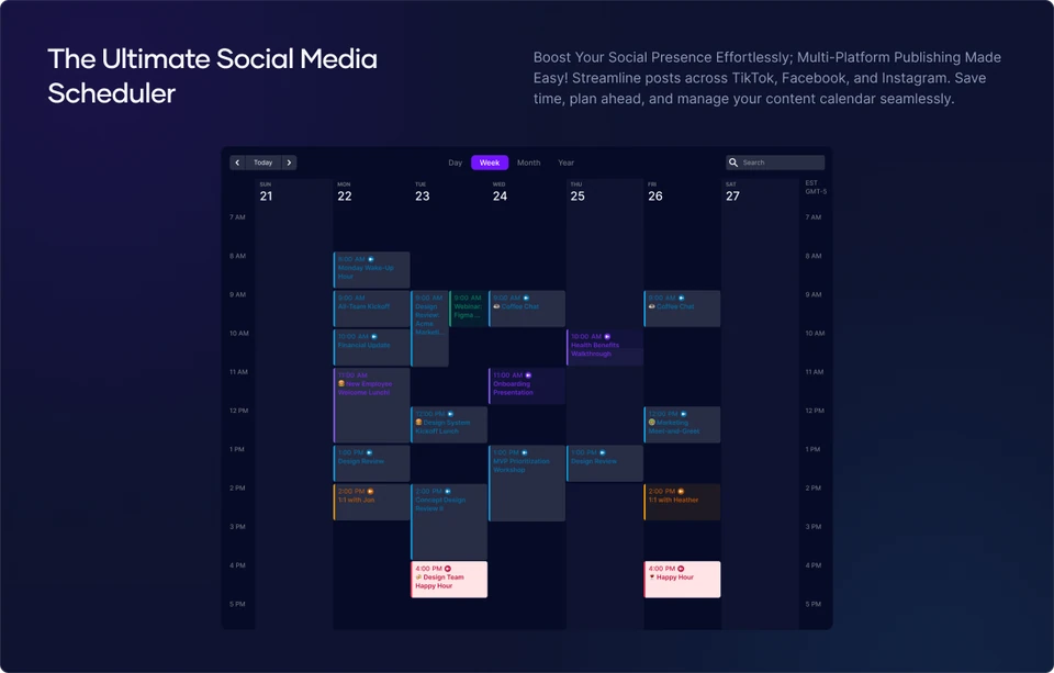
HelpMeGrow needed to feel like relief.
One less system to manage.
04 / The strategic angle
We stopped selling
more features.
We organized the product around a simpler narrative:
One place to
see, answer, and plan.
Know
See what is happening.
Analytics brings performance into view.Respond
Stay close to customers.
Messages and comments become one connected job.Plan
Keep content moving.
Scheduling gives the work a visible rhythm.05 / The page journey
A page structured around
increasing confidence.
- 01
What is this?
A social-management platform for e-commerce.
- 02
Why should I care?
Better visibility, engagement, and consistency.
- 03
How does it help?
Analytics, inbox, comments, and scheduling.
- 04
Can I trust it?
Specific product proof and customer evidence.
- 05
Can I try it?
A clear early-access conversion moment.
Each section answers the question that makes the next one worth reading.
06 / Above the fold
Understandable
at first glance.
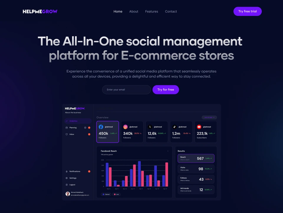 THE FIRST IMPRESSION
The hero establishes the audience, category, and core benefit before asking visitors to interpret the interface.
The dashboard then turns the promise into tangible proof.
- 01
Audience
Built for e-commerce owners.
- 02
Category
A social-management platform.
- 03
Product proof
An interface that makes the promise visible.
07 / From features to outcomes
Connected to
everyday work.
See which content drives attention.
Understand where the audience is responding.
Keep conversations moving.
Give messages and comments a place in the daily workflow.
Respond while interest is highest.
Make it easier to stay close to potential customers.
Keep every channel active and on-brand.
Turn content distribution into a repeatable rhythm.
08 / Product proof
Four real workflows.
One connected story.
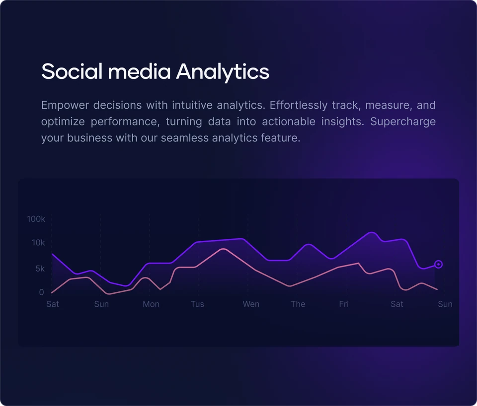
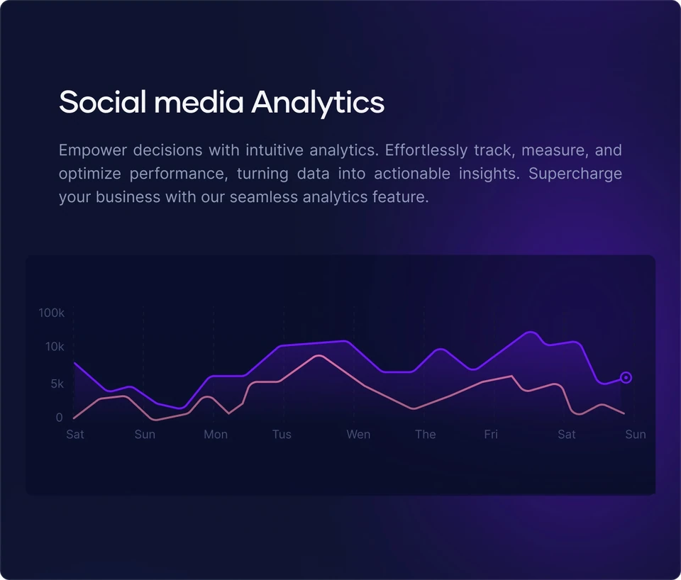
Know what is growing.
Bring performance into view so a store owner can see which content is getting attention.
A clearer view of what is working.
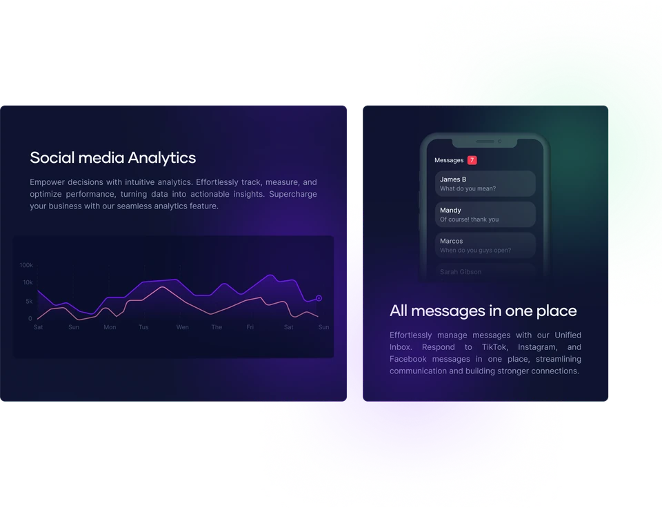
Interface details from the HelpMeGrow landing page design.
09 / Conversion
Interest first.
Action at the right moment.
The email capture appears in the hero for visitors who immediately recognize the need.
It returns after the product has been explained for those who need more confidence.
Hero email capture
Closing email capture
Spend less time managing channels.
Spend more time growing your store.

10 / The next iteration
Sharper proof would
make the story stronger.
The next opportunities to strengthen the landing page:
- 01
Replace placeholder copy with specific product value.
- 02
Lead with operational pain rather than “all-in-one.”
- 03
Add integrations near the hero.
- 04
Use testimonials with concrete outcomes.
- 05
Demonstrate the workflow with a short product animation.
- 06
Keep one primary conversion action.
11 / The outcome
A clearer way to introduce
a powerful product.
The final direction brings HelpMeGrow’s core workflows into one focused story. Visitors can understand how the product helps them see performance, stay close to customers, and maintain a consistent content operation.
One understandable promise.
Real interface moments.
From recognition to action.
HelpMeGrow did not need to appear more powerful. It needed to make its existing power easier to understand.
(Have a product that does a lot — but is hard to explain?)
Let’s make the
value obvious.
)%22%3E%3C%2Fpath%3E%3C%2Fsvg%3E)
30 minutes to talk through your product and page.