(Stackray / Case study)
Making invisible
SaaS waste obvious.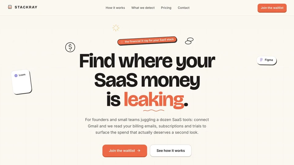
Turning an invisible SaaS spending problem into a product you understand in seconds.
01 / Project snapshot
A marketing page
with one job.
“The financial X-ray
for your SaaS stack.”
Scan Gmail for SaaS subscriptions, surface waste, and cancel the junk — evidence first.
stackray.xyz)%22%3E%3C%2Fpath%3E%3C%2Fsvg%3E)
- Product
- SaaS spend intelligence
- Stage
- Pre-launch / Private beta
- Primary goal
- Build demand + capture qualified waitlist signups
- Core action
- Join the waitlist
- Access model
- Read-only OAuth
- Charge today
- $0
Stackray wasn’t trying to sell software yet.
It needed to sell the problem, the insight, and the promise.
02 / The business problem
SaaS waste is invisible
until the charge hits.
Companies accumulate subscriptions across Gmail receipts, trials, employee accounts, price increases and forgotten tools.
Stackray could find those leaks.
But explaining that capability introduced another problem.
How do you make something happening quietly in someone’s inbox feel tangible enough that they’ll give you access to it?
Before Stackray
- Inbox
- Receipts
- Renewals
- Forgotten subscriptions
- $$$
What Stackray sees
- Inbox
- Evidence
- Findings
- Actions
03 / The positioning challenge
The product did a lot.
The website needed to say one thing.
Internally, Stackray can:
- Scan receipts
- Detect subscriptions
- Recognize price changes
- Identify duplicate tools
- Find expired / forgotten trials
- Surface unused accounts
- Provide evidence
- Eventually help cancel
But dumping all of that into the hero would kill the page.
The financial X-ray
for your SaaS stack.
Financial
Immediately establishes the domain.
X-ray
Communicates scanning something normally invisible.
Your SaaS stack
Clearly defines what is being examined.
04 / The strategic insight
Receipts,
not guesses.
For this product, trust is everything. Stackray is asking someone to connect Gmail.
Therefore the website can’t just shout “SAVE THOUSANDS!!!” That would immediately feel scammy.
Instead, the product was positioned around evidence.
Every finding needed
to feel inspectable.
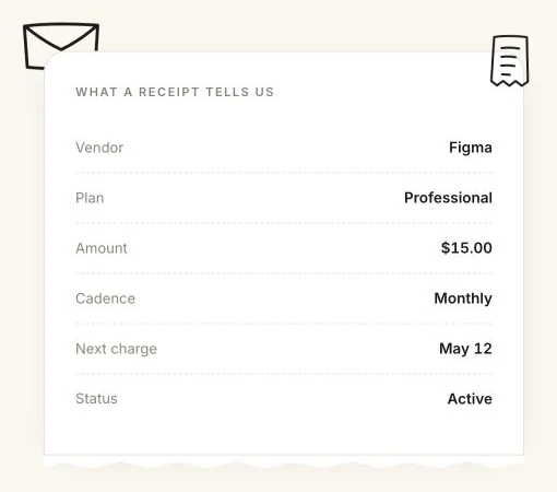
A financial claim should come
with the receipt attached.
And this influenced everything:
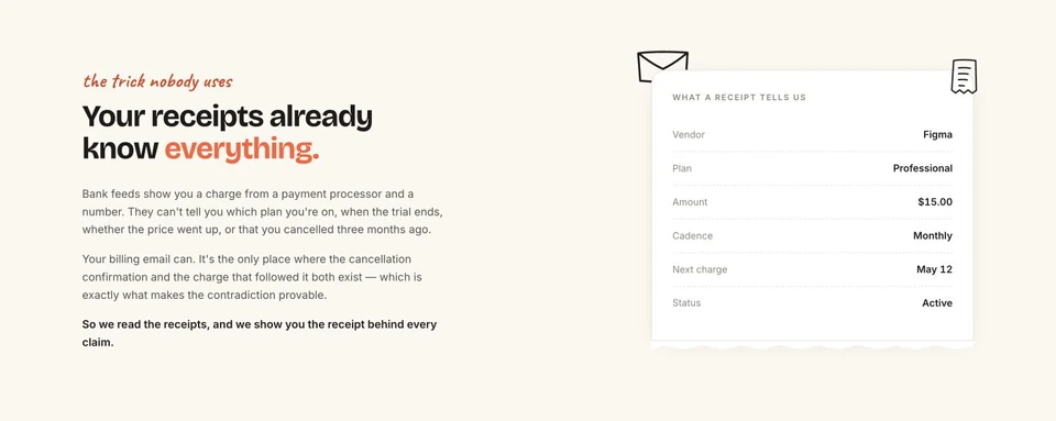
The evidence runs through the whole experience
- Product messaging
- Visual language
- Interaction design
- Security messaging
- Conversion flow
05 / Conversion architecture
One story.
One action.
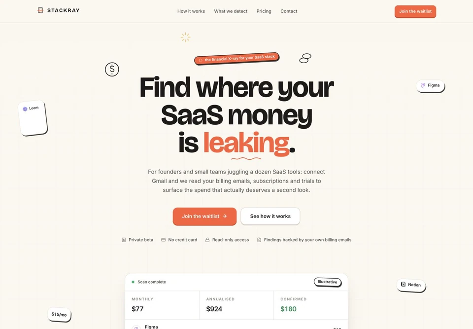
One clear promise before the product details.
Join the waitlistONE DESTINATION06 / Messaging
Copy was doing
conversion work.
Not decoration.
07 / Trust by design
The biggest conversion
objection was not price.
It was access.
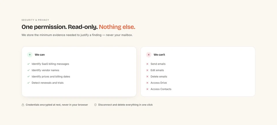
Read-only
OAuth access
No card
Needed today
Server-side
Tokens stay off browser
No selling
Of customer data
Delete
Access anytime
Evidence
Before action
Trust language was part of the conversion architecture — not a footer afterthought.
08 / Visual direction
A financial report
someone has already
investigated for you.
THE PRODUCT PALETTE
Warm documents. Clear evidence.
A little investigative energy.
- Ivory canvas
- Feels closer to documents and receipts than generic fintech.
- Charcoal bands
- Creates analytical moments and clear rhythm.
- Ember orange
- Acts like the marker/highlighter in an investigation.
- Doodles + receipts
- Make the evidence metaphor visible.
- Scan-line motion
- Reinforces the X-ray idea without becoming a gimmick.
09 / The experience
The strategy shows up
in the interface.
The evidence earns trust.
Something you can inspect.
Boundaries made visible.
10 / The funnel
Every road leads
to one action.
There was no reason to create competing CTAs like:
The business needed one outcome.
Join the waitlist.
One clear destination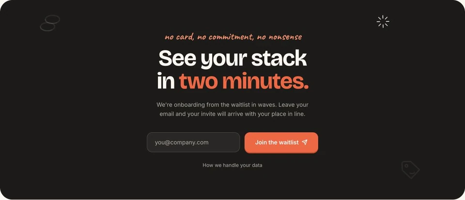
What happens after the click
- Form · email
- Backend · save
- Confirm · user
- Alert · founder
- Admin · invite
11 / Delivery
We didn’t stop
at Figma.
- 01Responsive production build
%22%20fill%3D%22var(--21h8s6%2C%20rgb(0%2C%200%2C%200))%22%20height%3D%2216.5px%22%20id%3D%22CcIDqS4bW%22%20transform%3D%22translate(2.25%203.75)%22%20width%3D%2219.5px%22%3E%3C%2Fpath%3E%3Cpath%20d%3D%22M%200%205.25%20L%203.75%209%20L%2012.75%200%22%20fill%3D%22transparent%22%20height%3D%229px%22%20id%3D%22txP0X4MiU%22%20stroke-dasharray%3D%22%22%20stroke-linecap%3D%22round%22%20stroke-linejoin%3D%22round%22%20stroke-width%3D%22var(--pgex8v%2C%201.5)%22%20stroke%3D%22var(--21h8s6%2C%20rgb(0%2C%200%2C%200))%22%20transform%3D%22translate(6%207.5)%22%20width%3D%2212.75px%22%3E%3C%2Fpath%3E%3C%2Fsvg%3E)
- 02Mobile-first interactions
- 03Reduced-motion support
- 04Live waitlist backend
- 05Position-in-line logic
- 06Confirmation emails
- 07Founder alerts
- 08Admin invite controls
The interface wasn’t handed off and forgotten.
We shipped the system collecting the leads.
12 / What shipped
No invented
conversion numbers.
Just the system that is live today.
What shipped
- Positioning
- Landing page
- Waitlist
- Confirmation
- Admin
- Invite
- Waitlist conversion
- CTA engagement
- Visitor → signup
- Traffic
- Invites sent
Stackray went from a complex product idea to a proposition someone can understand before finishing the hero.
13 / Founder takeaway
Your product probably
isn’t too complicated.
Your website may just be explaining it from the inside out.
Stackray had Gmail scanning, subscription detection, security, cancellation, evidence systems and multiple finding types.
The website didn’t need to explain all of them at once. It needed to make one idea obvious:
Connect your inbox.
See where your SaaS
money is leaking.
(Make the value obvious)
Complex product?
Let’s make it click.
No long sales discovery.
30 minutes to audit your current site.
(Project)
Next Project

An all-in-one social platform, shaped into one clear story for e-commerce owners.